TL;DR

Get everyday helpers delivered free with Prime
- Fast, free delivery on millions of items
- Prime Video, Amazon Music and more included
- Member-only deals all year
High-contrast kitchen tools help users distinguish utensils, food, and controls more easily by emphasizing brightness and light-dark differences. Focus on contrast with surroundings, simple design, and tactile cues for best results.
Imagine trying to cook in dim light with a knife handle that blends into the countertop. Frustrating, right? High-contrast kitchen tools cut through visual clutter, making everyday tasks safer and more manageable. Whether you’re adapting for low vision or simply want clearer organization, choosing tools that stand out is a game-changer.
In this guide, you’ll learn how to pick the best high-contrast tools tailored to your kitchen, lighting, and needs. We’ll cover color and design tips, practical examples, and simple checks to ensure your tools work for you—boosting confidence and independence in your space.
Contrast relies on brightness differences, not just color hue, making it more reliable in varied lighting.
Test tools in your kitchen under your usual lighting to confirm they stand out in real conditions.
Combine visual contrast with tactile cues like textured grips or raised markings for better safety and recognition.
Use simple, bold shapes and avoid cluttered patterns to make tools easier to identify.
Regularly check and replace tools that have faded or become less visible to maintain safety and independence.
How to Choose High-Contrast Kitchen Tools
Tools become easier to locate, identify, and control when they visibly separate from the countertop, cookware, food, and surrounding clutter. Choose for your real kitchen—not the store display.
Contrast is a relationship between an object and its background—not a property of the object alone.
Visibility begins with the whole scene
A “bright” tool can disappear on a similarly bright surface. Judge the difference in lightness, simplify the visual field, and add a second way to confirm what you are holding.
Contrast the background
Use dark tools on pale counters and light tools in dark cookware. Recheck when the food or work surface changes.
Light–dark beats hue
Red and green may differ in color but remain close in brightness. A strong tonal gap is more dependable.
Choose bold simplicity
Distinct shapes, solid finishes, large labels, and uncluttered controls are faster to recognize than patterns.
Control glare and shadow
Bright, even task lighting supports contrast. Matte or satin finishes usually reveal edges better than glare-heavy surfaces.
Add tactile confirmation
Textured grips, raised marks, click stops, and engraved measurements reduce reliance on vision alone.
Function still comes first
Prioritize non-slip handles, stable bases, blade guards, insulation, locking mechanisms, and manageable weight.
Match the tool to the task background
No single color wins everywhere. Keeping light and dark versions of frequently used items provides flexibility when countertops, pans, and ingredients vary.
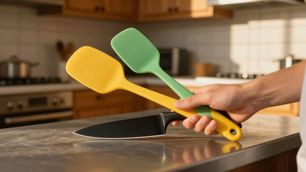
Strong separation: opposite brightness levels
Reverse the pairing as the surface changes
Pick tools that stand out in real life
Move from visual comparison to hands-on testing. The final decision should reflect your usual lighting, surfaces, grip, and routine.
Oppose the background
Start with dark-on-light or light-on-dark.
Check brightness
Look beyond color names and judge tonal separation.
Test usual lighting
Include daylight, overhead light, shadows, and glare.
Feel the controls
Seek texture, raised labels, stable grips, or sound.
Use before committing
Test orientation, reach, cleaning, and daily handling.
What high contrast looks like by category
Use these examples as starting points, then reverse or adapt the pairing for your own food, surfaces, and visual preferences.
| Tool | High-contrast features | Practical example | Extra confirmation |
|---|---|---|---|
| Cutting boards | Board tone contrasts with the food; plain surface | Dark board for onions, light board for leafy greens | Textured base |
| Knives | Visible handle against worktop and knife block | Bright handle on a dark counter or in a pale block | Non-slip grip |
| Measuring tools | Large markings with strong tonal separation | Dark numerals on a pale, opaque cup body | Raised marks |
| Cookware | Interior contrasts with food; handle contrasts with pan | Light interior for dark sauce, dark pan for pale pasta | Insulated handle |
| Utensils | Simple silhouette; handle visible on counter and pan | Light spatula in dark cookware | Distinct texture |
| Controls | Large knobs, bold indicators, clear on/off state | Pale dial with a dark position marker | Click stops |
| Timers | Large backlit display and uncluttered digits | Bright display on a dark case | Loud alert |
| Dishes | Plate contrasts with food and table surface | Dark plate for pale rice on a light table | Defined rim |
Layer cues instead of relying on color
The strongest setup combines tonal contrast with lighting, tactile information, simple design, and safety-focused ergonomics.
Selection priority
A practical hierarchy for comparing two otherwise suitable tools.
Can you find it quickly?
Place the tool among normal kitchen clutter and scan from your usual working position.
Are its edges clear?
Watch for shadows, patterns, reflections, and transparent materials that obscure boundaries.
Can touch confirm it?
Identify the grip, orientation, measurement, or control state without depending entirely on sight.
Will the finish last?
Favor colorfast, washable materials and engraved or raised markings over fragile printing.
Strong tonal difference
Even task lighting
Tactile confirmation
Clear safe action
Confidence and independence
Contrast needs maintenance
Stains, scratches, fading, and changing lighting can weaken a previously effective setup. Review frequently used tools before visibility becomes a safety issue.
Add tactile markers or high-contrast tape when appropriate, but replace tools if wear affects grip, stability, heat protection, labels, or safe operation.
What colors provide the best contrast?
Black and white usually create the strongest tonal difference. Bright yellow or white can work well against dark backgrounds, but the best pairing is the one that remains distinct in your lighting.
Is red always best for low vision?
No. Red may be visible in one setting and blend into another, and it may be difficult for some people with color-vision deficiencies. Brightness contrast is generally more dependable than hue alone.
Why Brightness and Light-Dark Contrast Matter More Than Color
High-contrast tools rely on differences in brightness, not just hue. A white spoon in a dark pan is clearly visible because of the stark light-dark difference. An orange handle on a dark countertop stands out, but a yellow handle on a pale surface might not.
Research shows that brightness contrast is more reliable than color alone, especially in dim or cluttered kitchens. For example, black utensils on a white background provide a vivid, unmistakable visual cue, even if the color palette varies.
Think of contrast as a relationship—how much one element stands out against its background. The more distinct the difference, the easier it is to spot and use confidently. This matters because it directly impacts safety; poorly contrasted tools can be mistaken or overlooked, increasing the risk of accidents. Conversely, well-contrasted tools can reduce hesitation, allowing for quicker, more accurate actions, which is vital when handling sharp or hot items.
Popular right now

Dyson V8 Cordless Vacuum
LG C2 Series 65-Inch OLED evo 4K Smart TV (OLED65C2PUA, 2022)

Bose QuietComfort Wireless Bluetooth Headphones with Active Noise Cancellation, Mic, USB‑C Charging, Deep Bass, 24‑Hour Battery – White Smok
As an affiliate, we earn on qualifying purchases.
5 Simple Steps to Pick Kitchen Tools That Stand Out
- Match tool color with your background: Use dark tools on light surfaces and vice versa. For example, a dark cutting board with light-colored utensils helps everything pop. This simple step can prevent misidentification and accidental mishandling, especially in busy kitchens.
- Focus on brightness contrast: Choose tools with bold, solid colors or finishes that reflect or absorb light differently from their surroundings. This enhances visibility regardless of ambient lighting conditions, which vary throughout the day and with different fixtures.
- Test under your usual lighting: Place tools on your countertops and view them in your typical kitchen lighting—preferably with natural light and some overhead bulbs. This step ensures that what works in a store or on a display translates into real-world visibility in your environment, accounting for shadows, reflections, and lighting angles.
- Look for tactile cues and large labels: Raised markings or textured grips help confirm what’s what without relying solely on sight. These tactile features also provide confirmation when visual cues are insufficient, which can be crucial during quick or delicate tasks.
- Try before you buy: Evaluate tools in your kitchen, checking visibility in real-world conditions, not just in the store. This practical test helps identify any subtle issues like fading or blending that could compromise safety during daily use.
Compare Common Kitchen Tools: High-Contrast Options
| Tool | Ideal High-Contrast Features | Example |
|---|---|---|
| Cutting Boards | Dark color for light foods, light color for dark foods; textured surface | Blackboard for pale vegetables; white board for dark meats |
| Knives | Bright handles with high contrast to work surface; large, easy-to-see shape | Orange handle in a white or dark-colored block |
| Measuring Cups | Bold, engraved markings; contrasting color with cup body | Red markings on a clear plastic with a white background |
| Cookware | Light interior for dark foods; contrasting handles | White interior pan with dark handles |
| Utensils | Handles contrasting with work surface; simple, bold shapes | Bright blue spatula handle on a dark pan |
Using Lighting and Tactile Cues to Make High-Contrast Tools Work Better
Contrast alone can’t do all the work—good lighting and tactile cues boost safety. Bright, even task lighting reduces shadows and glare, making contrast more effective. Think of it like turning up the brightness on a photo to see details clearly.
Adding raised markings, textured grips, or audible alerts can confirm what you’re using without needing perfect sight. For example, a textured handle on a knife helps you grasp it confidently, even in low light or when your vision is foggy.
Imagine cooking at night. Well-placed under-cabinet lights and a textured, brightly colored spatula make all the difference, turning a confusing clutter into a clear, organized workspace.
Design Tips for Choosing and Using High-Contrast Kitchen Tools
- Pick simple, bold shapes: Avoid intricate patterns or decorations that can obscure edges or markings.
- Prioritize ergonomics and safety: Non-slip handles, stable bases, and heat-resistant materials support confident use.
- Combine visual and tactile cues: Use tools with raised markings, textured surfaces, or contrasting colors to reinforce recognition.
- Test in your own kitchen: Check visibility in your usual lighting and against your surfaces—what works in the store may not in your space.
What to Do When Your Tools Fade or Don’t Stand Out
If your high-contrast tools lose their visibility over time, it’s time for an upgrade. Scratches, stains, or fading can reduce contrast, making tools harder to see. When tools become less visible, it can lead to misidentification, increased risk of accidents, or difficulty in locating needed items quickly. This can compromise safety and independence in the kitchen, especially for those with visual impairments.
Replace worn tools with those that have durable, colorfast finishes. Consider adding tactile markers or using high-contrast tape to boost visibility. Regularly test your setup by viewing tools under your usual lighting conditions. This ongoing maintenance ensures that your tools continue to serve their purpose effectively, preventing hazards and maintaining confidence during cooking.
Remember: the goal is clear, confident use. When in doubt, keep a few extra bright tools handy and adjust your lighting to see everything better.
Frequently Asked Questions
What colors provide the best contrast?
Black and white usually offer the strongest light-dark contrast, making objects stand out clearly. Bright yellow against dark backgrounds or white against dark surfaces also work well. The key is to choose colors that create a stark brightness difference in your specific lighting.
Is red the best color for a visually impaired person?
Not always. Bright red can be highly visible in some settings but may blend into dark surfaces or be difficult for people with certain color-vision deficiencies. Brightness contrast is generally more dependable than hue alone—test your tools in your kitchen’s lighting first.
Which cutting-board color should I choose?
Pick a dark-colored board for light foods like potatoes or onions, and a light-colored board for dark foods like meats or leafy greens. Keeping two contrasting boards can help quickly identify the right one while reducing cross-contamination.
Are colored knives safer?
A brightly colored handle can make a knife easier to find, but it doesn’t improve safety on its own. Focus on secure handles, proper storage, and safe cutting techniques for overall safety.
How can I judge contrast before buying?
Place the tool against surfaces similar to your kitchen and view it under your typical lighting. Taking a grayscale photo with your phone can reveal if the object merges into the background—if it does, it might not provide enough contrast.
Conclusion
Choosing high-contrast kitchen tools isn’t about fancy colors or gadgets. It’s about making your space more visible, safe, and organized—so you can focus on what really matters: cooking and living with confidence. A few simple swaps and adjustments turn everyday tasks into routines you trust.
Next time you’re in the kitchen, glance at your tools through a new lens. Brighten your workspace, simplify your choices, and watch how much easier cooking becomes.